(some of the pictures of the magazines and their pages are form recent magazines)
Today I am going to talk about Company Magazine and the things I found interesting and would like to use the ideas for our group magazine.
 |
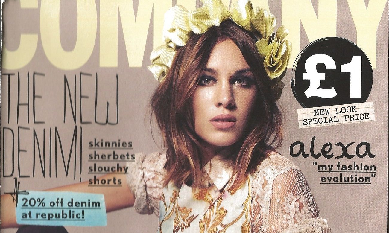
November 2012 Issue of Company Magazine
FRONT COVER
I really like the cover of Company's November 2012 issue. It might come across as a very busy front cover but in actual fact, its quite organised, you have the magazine title at the top, the bar code at the bottom right, and the woman's name who features on the front cover at the top right. I've noticed when buying or flipping through the magazine at the shops, that the person who features on each issue cover, has their name written always at the top right side of the magazine. I think that this consistency is good because it it makes it easier for the reader to locate, because they know that it's always going to be there.
|
 |
| This is a similar typeface to the Company one |
INNER PAGES 'The Superblogger' image of the two girls are from a recent issue, in fact it's the January 2013 one. I love this page because it's colourful and eye-catching. I also like how they've integrated the lion theme to their outfits and logo. I think that the reason they choose to use the lion is because it's a big and majestic animal, 'king of the jungle' etc. The editorial was going to be reflect that by using the two top UK fashion bloggers to promote their issue. The title of 'The Superblogger' is a great way of mirroring the lion theme. The next page of the High-Street edit 'You Wear The Trends' , is separate from the other page. I love how despite the magazine being a busy one, this page is quite basic but neat and organised. You have the title at the top, the sub-heading in the middle, the caption text beneath it and the images all at the same sizes even though they are spread differently. This street edit page is a brilliant idea because it allows the reader to connect with the pictures, the images of the girls and what they're wearing is easier to approach and follow compared if you have images of the likes of Kate Moss wearing designer clothes like Versace, Alexander McQueen, Chanel, Louis Vuitton and etc. I also like how Company put their name and age at the bottom right hand side, written in black and set in a white background.   |


These pages come from a September 2012 issue of Company magazine. I really like this editorial because it's so pretty and well laid out. On one side you have the title 'Rising Star: Everyone's Cup Of Tea' with the introductory sub-heading. I like how the paragraph of the interview starts with a large capital S in a big, bold, black typeface. This immediately catches your eye to the story. I also like the fact when the interviewer asks Lucy Rose a question, it's highlighted in a sea green colour (it matches with the nail varnish at the opposite page). Another think I like is that in the title 'Everyone's Cup Of Tea', the background colour is in a light brown shade like the ones in the next page, Company used the colours of the photoshoot of Lucy (orange hair, reddish background setting etc) to create this effect. In the next page, I like how they used make-up to highlight the clothes and the sofa colour of the photoshoot. It's colour coordinated and organised. I think that the 'Get Lucy Rose's Look' with the music playlist type arrows (this is clever because Lucy's a singer-songwriter), again this is set against a black background and is written in capital letters.